


 I loathe, with a passion, really bad PowerPoint.
It's right up there with bad clip-art and motivational posters.
I'm either patronised by some speaker who insists on proudly 'reading the slides out load’ to me (often in full sentences instead of bullet points) or dazzled by graphical incompetence when the text is so damn small you have to squint to read the damn thing and through ruinous colour choice (dark blue and fuchsia, I was there, honestly).
Johova spare us from tasteless flying text and moving graphics (this is not soddin’ Quantel and we are not in 1982). Deliver us from bobbo sounds and mingin’ music. Protect us from overly complex diagrams or poorly conceived pie-charts. The list goes on…
I had to do a presentation to our sales and marketing team last week, on SEO and how we go about doing a "Seraphim Proudleduck" on our Northcliffe and commercial sites, and I played and fine tuned my PowerPoint (over a period of days) to make sure I was going to get message across clearly and with the minimum of crud.
On the whole, everyone else presenting had done this too…
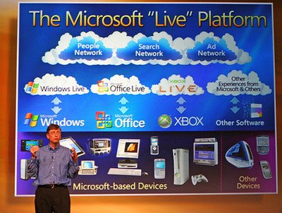
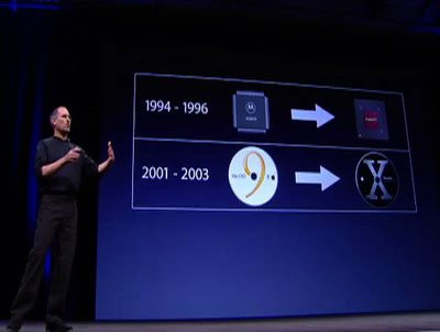
Either way, Gates, Jobs, & the Zen Aesthetic (Bill Gates v's Steve Jobs: a lessons in contrasts), on the Presentation Zen blog takes this a step further.
I'd say it offers a vital and essential warning sign to anyone who has ever considered standing up in front of their colleagues and justifying their existence.
 Continuing the moan, companies should take measures to train their managers and staff in the use of PowerPoint to present information in meetings. PowerPoint is a valuable tool, it's the use of that tool that's the problem. Too many folk use PowerPoint as a 'substitute for themselves' and seem to think that the slides are the presentation instead of the slides supporting the presentation that they should be delivering.
Audiences should be issued with automatic weapons.